|
By Min Lee, Managing Director We are thrilled to announce that as of today, we are launching our new brand! This new identity reflects our transformation and growth in the past few months, and more importantly, captures our core beliefs and aspirations for the future. THE NAME As the one place for all your home care needs, we played on the word “Kaza” which stands for “home” in many languages, and combined it with “Care” which represents the essence of our offering, making KazaCare! We also wanted a brand that stands for something bigger. While we provide quality home care, we do so with the ultimate purpose of enhancing our client’s quality of life. This is reflected in our tagline “because your life matters”. This core purpose guides the way we design our holistic care plans, how we choose and collaborate with partners, encompassing the 7 domains of active living that has been researched to contribute to a better life. THE INSPIRATION It started with our core beliefs. Beginning with our clients at the centre of the care, we aim to serve as an enabling platform, which facilitates a community of medical and care professionals to collaborate and coordinate, with the common goal of achieving the best outcomes and quality of life for our clients. This allows our clients to benefit from one coordinated care plan and multi-disciplinary expertise, and also encourages professionals from diverse disciplines to share and exchange, building a learning community that is generous, committed to professional development, and innovating to push new frontiers! OUR VISION 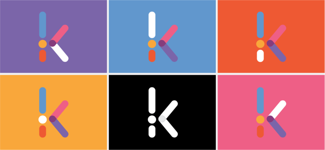 We hope to bring even more innovation to home care, and believe this is a sector that is rich in possibility, with a potential to create many new and meaningful jobs in these difficult times, while serving such an important need in our society.
We wanted our colours to reflect this hope and dynamism - in a style that is friendly but professional, modern yet warm and compassionate, representing the same level of care and commitment we have to our clients so far. The different colours also vividly represent the different services offered including personal care, nursing care, personal assistance, therapy and wellness! We take this opportunity to thank all our loyal customers and partners for your trust and friendship on this journey. A special thanks to Isabelle Montocchio Drouin at iSBRANDING & COM who developed the brand platform, naming and tagline, and Michelle Kirkwood at Mink Design Studio for our corporate identity. Thank you for accompanying us in this journey. We are amazed by how you embodied our values and vision, and brought this to life in record time! Feel free to reach out with any thoughts, requests, or comments. We are always here for you!
4 Comments
Aurélie THESEE APAYA
16/8/2021 11:06:29 am
À big bravo for this initiative and project that is so much needed in our country. I am à podiatrist (podologue) working in MRU since 2015 and if you need this spéciality, would be glad to help.
Oxenham Isabelle
5/4/2024 11:36:18 am
Bonjour, Leave a Reply. |
AuthorWrite something about yourself. No need to be fancy, just an overview. Archives
March 2022
Categories |
 RSS Feed